Albeit that we have not yet put our Fall sweaters on, the fashion industry is well ahead of the game and already have Spring & Summer 2014 ready for our shopping bags. The truth is that in the world of fashion, designers are many seasons ahead of what is being revealed on the runway.
The recent Fashion Week unveiled the styles, fabrics and colours that will dominate our wardrobes next spring. It is my observation of every fashion week that the net is thrown wide from most fashion houses with the attempt to capture some of the attention. For Spring 2014, the colour palette is varied and offers something for every taste.
Pantone.com describes Spring 2014 colour influences as
'A Season of Colorful Equilibrium'. Equilibrium .... like the equal balance between powers? Well certainly if that is the case, then the upcoming spring colour choices will provide the opportunity for experimentation of new looks and colour combinations {as stated by Leatrice Eiseman of Pantone Color Institute}. The palettes couldn't be any more removed from one another if they tried and yet they will all play the in proverbial summer sandbox quite well together.
Early spring offers the opportunity to play in natures sandbox with neutral tones that will allow wearers to transition easily from the dark hues of winter into the soft romantic tones of summer. Typical of spring it begins with playful names like : Khaki, Sand, Honey, Grey. The sames shades that play in deeper tones during the winter months, but we bring them to life in the spring with more subtle renditions in softer fabrics.
Warm tones bring the heat into the spring and summer scene for 2014 with a vibrancy that helps the season sizzle. The palette runs from the bright golden tones up the scale to hot pinks and sexy shades of red. This spring you will get familiar with colourful names like : Canary, Watermelon, Cherry, Red Orange and Crimson.
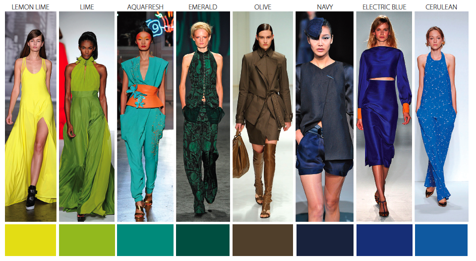
Summer wouldn't be complete without the colours of the ocean washing into our fashion closet. Spring 2014 will be no different and she offers a splash of tones that are sure to keep you cool. Cool tones for Spring 2014 include shades with names that bring the Caribbean waters to your doorstep : Lemon and Lime {think of those cool summer bevy's}, Aqua, Emerald, Cerulean.
The colour palette that is getting most of my attention are the Soft Tones. Yes, I'm a romantic and can't resist the soft ice-cream-parlor shades that make everything quite simply 'pretty'. Soft shades of pink, blue, mauve, yellow, make even the most casual of fashions look special. There is something striking when a soft tone is presented in a strong fabric - think petal pink wool jacket {ok, of course I'm thinking Chanel}. But it is in spring and summer that we get to play in not only soft tones but floaty, soft fabrics. The romance of the season is played out when shades of Watermelon, Sorbet, Peach, Lavender, Seafoam, and Powder are wistfully presented.
Possibly one of the reasons I love the soft shades so much is because it reminds me of Laduree. How deliciously sweet the spring season will be.
 |
| Oscar de la Renta - Spring 2014 |
 |
| Oscar de la Renta |
 |
| Oscar de la Renta |
 |
| Burberry - Honey skirt & jacket, powder blouse |
 |
| Burberry - Lavender and Pink |
 |
| Burberry - Sorbet and Buttercream |
The autumn leaves have yet to fall, but with a palette as pretty as this I am ready for spring to bloom.


I have loved reading all the blogs about Fashion Week and Oscar de la Renta's collection was definitely a favorite...gorgeous images here!!
ReplyDelete